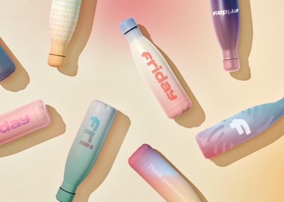

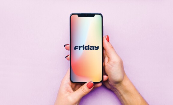

A long time friend was developing a first-of-its-kind babysitting app. The idea was to create localized social groups of parents & sitters for quick childcare referrals, scheduling and payment. Our role was to help define the key audiences, to name the service, and to create a visual language for the brand. We loved the name “Friday” which harkens to a fun night out as well as to a “guy- or girl-Friday” helper. From there, a cool and easy to use teenage business world could be born.

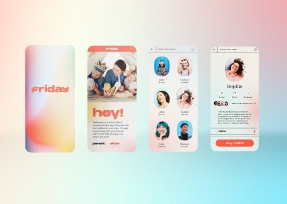
The most important touchpoint for Friday was the in-app experience itself. We worked closely with developers to design an intuitive user interface that extended the brand feel through the interaction. A key challenge was balancing the user experience for social savvy babysitters as well as less digitally-native parent customers. Fun, simple, and trust-worthy can sometimes be competing ideas.
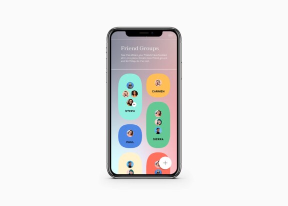
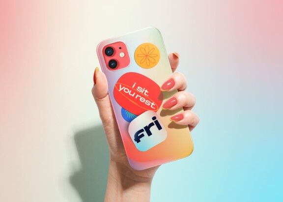
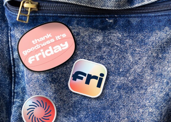
We worked hard to make Friday live on- and off-line, thinking of it as a lifestyle brand for young people. Shown is a screen of the neighborhood network groups of sitter referrals and a few of the collectible stickers to promote the service. We also crafted real world accessories to promote the app during the in-home service.


Creative and strategic thinking to help a startup succeed
Evaluate positioning through layered audience hierarchy
Brand voice equals trust and emotional connection
Naming and identity design
User interface design
Brand extensions and visual language
Photo illustration and image library
